
The whole idea of this contest is to get some feedback on our layouts.
After my feedback I have made some changes. My feedback was that the pin was too big - which seems galringly obvious now that it has been pointed out to me. The word art should have some pixels deleted where it went over the photo to make it look like it had been stamped, maybe take the shadow off the wordart and also the ribbon cut the photo into two.
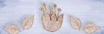
So I have moved one of the papers and made it horizontal and then put the ribbon around this. This meant I could move the photo over and make the word art a bit smaller so it was no longer on the photo. I have decreased the size of the pin.
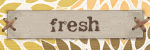
The only difference between the 2 layouts below is the word art - one has the shadow and one doesn't - what do you think? Which is better?


Like this better with out the shadow, Hope that I am saying the right thing
ReplyDeleteI like it better with the shadow, as it is far enough away not to look so much like a shadow more like a double title.
ReplyDeleteI prefer it without the shadow Claire
ReplyDelete